
I found this photo of Gordon Brown. He is not very popular right now. I've got an idea for a poster with Mr. Brown as the main character.
Watch this space. . .

 Nick Veasy. A real size X-ray. Nick Veasey will be exhibiting his work at Maddox Arts in London from October 31 to December 5
 In Detroit @ 3om height. I was there last September. Loving the photo.
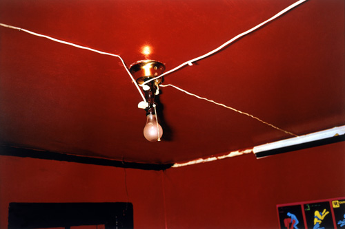
 Designed in England. . . yes!
 Think this is quite a good photo I took of my Dad. Us swedes are totally OK with wearing pink :)
 Somewhere around the cornish coast line, perhaps Dartmouth area. . . we stayed one night in Brixham, I also found a village called Brixton... which was different to London's Brixton indeed. I saw loads of names on streets and villages that are already in London. . . what happened? Also stayed in Padstow, north of Newquay... really nice there.. reminded me of the Swedish westcoast which I strongly recommend.
 Car problems? The rental car was leaking, but we figured out that it was condensation from the A/C.
 A poor bird who couldn't fly properly because of a plastic bag, i'm myself using organic bags.

 I'm making the Mönster-promo in 1920x1080 resolution!
 This is what the studio set-up looked like after I set it up. I had my laptop, projector and camera next to the table. Then rolled the black paper out as flooring. One issue is that the paper is only 3 meters wide.
 The strong light is from an external flash.
 So. . . I was given a brief by Panasonic through my college and took it as my self-initated project. This self-initiated project is meant to be for you to explore anything within moving image. I thought about making a short-film but decided to pick a brief, in this case the Panasonic brief. I chose to work on this brief as I like technology companies and their products. My analysis of the brief tells me that they want to underline the fact that every part of their new G-10 TV is the hub of the 21st century home. The TV is the center of it all, where you can re-live memories and TV, Internet, Film.


 The three elements (representend in RGB) Video, Still and Blue Ray DVD can be enjoyed on the G-10 with over 2m pixels, full-HD.


The logo is made in 3D to emphasize what Mönster is all about: embossed and depressed tiles that create patterns in your chosen environment.
Me and Carl (the man behind mönster) are shooting for the promotion of the brand release. I want to illustrate how the brand is actually 3D by using projections, potentially lasers onto the surface. I am thinking straight lines moving up & down that will move in interesting ways on the surface. This simple line will show how straight lines connect and construct patterns.
I looked at some research for lasers and I’m tempted to buy a laser with optics to spread the beam. This can then be captured with long exposure photographs or video.
I am visualising straight lines being projected onto the typeface I created to show the depth.